
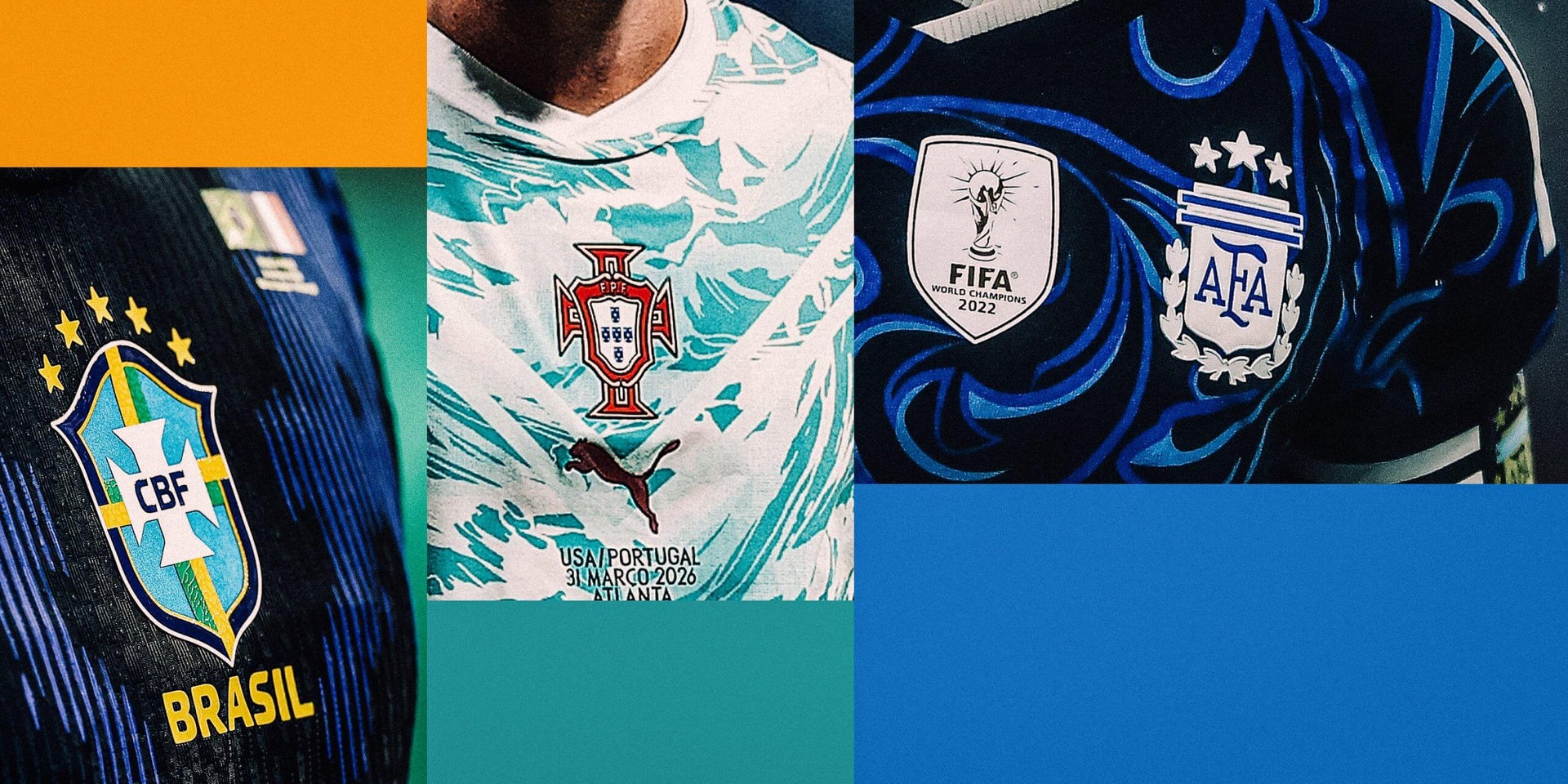
The World Cup offers a spectacle not just on the field but also through the kits worn by the teams. This year’s tournament features away kits that vary widely in design and creativity. We’ve taken a look at all 48 away kits to see which ones stand out.
Puma
The Swiss away kits, influenced by the country’s passports, present a color that feels incongruous and overwhelming, often resembling a hue only suitable for high visibility safety clothing.
Saeta
Haiti’s supplier, Saeta, brings a bit of diversity to kit manufacturing, deviating from larger brands. Despite the unique palm tree design on this kit, overall it lacks appeal.
Nike
Norway’s all-black ensemble claims inspiration from Viking warriors. Despite the fierce theme, the monochrome shirt lacks the expected variation in design.
Puma
Portugal’s away kit, with its ocean-themed top half, aims to pay homage to legendary players. However, the design leaves a strange impression, failing to clearly connect to the legacy.
Adidas
Qatar’s kit seems like an afterthought, offering a simple white shirt accented with maroon stripes, hinting at a rushed design process by Adidas.
Minas Panagiotakis/Getty Images
Canada’s away kit evokes the aftermath of a dusty construction project, leaving an impression of a design that doesn’t quite hit the mark.
Pixsell/MB Media/Getty Images
While Croatia’s away design maintains the pattern of the home kit, the blue shades offer a somewhat less controversial application than the storied red and white checkerboard.
ANP via Getty Images
This kit feels like it strips away too much personality, despite a pleasant blue color accented by gold trimming. The minimalist approach feels like a missed opportunity for creativity.
Christian Bruna/Getty Images
The floral motif presents a novel concept for this shirt but veers into the territory of trendy streetwear, particularly challenged by the pale purple color choice.
Kelme
A clear victory for color contrast, the strong yellow and blue pinstripes against the white of this shirt make it a standout. It demonstrates how thoughtfully applied color can elevate a design.
Jamie Squire/Getty Images
The United States’ shirt feels more like a training top than a competitive kit. Its connection to the American flag is commendable, but the design might not resonate strongly with fans.
Ryan Hiscott/Getty Images
Ghana’s bold kit draws on cultural market influences, offering a striking gold and yellow pattern. Its audacity to stand out is preferable to an uninspired design.
Shaun Clark/Getty Images
Brazil’s shirt channels the poison dart frog, combining the Jordan brand with a striking Rorschach-like pattern. This blend of influences results in an imaginative yet peculiar design.
Capelli Sport
Cape Verde’s kit takes a different turn from its home version, but fails to leverage its color palette for significant impact, resulting in a rather forgettable white shirt.
Pavel Lebeda/Soccrates/Getty Images
Crystals inspire the Czech Republic’s away kit, yet what’s presented is a pattern reminiscent of suburban decor. Despite its safe approach, the design lacks strong character.
Puma
Egypt’s away kit incorporates its famous pyramids into the background design. Instead of being overtly thematic, the shirt remains versatile yet connected to national symbols.
Umbro
This shirt features fading patterns from top to bottom, yet its appeal relies heavily on the complimentary design of the home kit, raising questions about standalone value.
Puma
The New Zealand kit ties design aesthetics with cultural elements like hau. Its swirling patterns offer visual intrigue, sidestepping overt symbolism for a more abstract appeal.
Jordan’s kit opts for practicality over an elaborate design, with simple color swaps making a statement that doesn’t quite translate the nickname “Al Nashama,” or “The Chivalrous Ones.”
Adidas
Algeria’s shirt tries to capture its diverse landscapes in patterns that are too subtle to appreciate, overshadowed by a compelling green and red contrast.
Rich Graessle/Icon Sportswire via Getty Images
This shirt from Adidas dismisses elaborate designs, instead offering an understated but classy blend of gold and green against white.
Valerio Pennicino/Getty Images
This design imagines a futuristic throne room, a nod perhaps to visual art or expanded contexts usually not associated with football kits, offering a unique visual.
7Saber
A refined effort, the white-on-white design balances subtlety with standout accents. The chosen trim colors work effectively to create a refined appearance.
Nike
Australia proposes innovation resembling a color scale concept. This idea stands out, introducing variation into conventional sportswear presentation.
Yagiz Gurtug/NurPhoto via Getty Images
Turkey’s design upholds tradition with a modern flair, showing cohesion between kits while finding space for subtle yet effective design changes.
Severin Aichbauer/SEPA.Media /Getty Images
The Austrian shirt incorporates coffee house motifs, reflecting cultural influences uncommon in kit design. Emotional storytelling pairs well with visual aesthetics here.
Kamil Krzaczynski/AFP via Getty Images
Mexico’s shirt, despite its simple appearance, emerges as a favorite. It blends cultural elements without overstatement, allowing focus on clean design and bold, contrasting trim.
Franco Arland/Getty Images
Senegal’s kit uses a vivid graphic that, while untraditional, sparks interest and connection, albeit carrying potential confusion due to similarities with a rival nation’s style.
Reebok Panama
Reebok reintroduces a nostalgic design, reminiscent of Bolton Wanderers, while aligning with Panama’s current aesthetic, capturing attention through familiarity.
Rich Storry/Getty Images
This kit uses central positioning of logos as a last-minute differentiator, creating variations within a broadly similar design from the home variant, ultimately feeling less cohesive.
Adidas
Sweden relies on history, reverting to a proven formula. Here, a subtle yet effective pattern adds to its aesthetics. Minor structural elements, like collars, signify attention to detail.
Franco Arland/Getty Images
Tanzania’s shirt draws on abstract geographical influences, fusing artistic interpretation into sportswear, encouraging playful critique of design purpose versus aesthetic success.
Mike Nowak/Getty Images
The complexity of this design from Adidas finds balance through juxtaposition of vibrant colors and minimalistic trim, a recurring theme in sportswear grounded in a clean aesthetic.
ANP via Getty Images
The Netherlands’ use of orange commands attention, applying minimal color to maximum effect, bridging tradition with modern tweaks, especially through striking chest bands.
Adidas
Serbia presents a visually firm kit, respecting established design identity through subtle detailing and contrasts, thoughtfully reserved to highlight the shirt itself.
Marc Atkins/Getty Images
Central Africa’s striking design dismisses minimalism, blending cultural and pattern identity to vibrant effect, challenging norms with a fresh, busy look.
Andrew Milligan/PA Images via Getty Images
Scotland’s kit embraces retro inspiration, showing holistic cohesion with past designs while maintaining contemporary relevance in an era that appreciates both old and new.
Jean Catuffe/Getty Images
This kit leans towards pastel palettes, stepping into less-charted territory with a soothing, harmonic presentation, daring to defy masculinity norms traditionally seen in sports kits.
Kappa
Tunisia achieves striking design cohesion through symbolic representation, using the eagle to brand its team while integrating it into a meaningful visual narrative.
Gongora/NurPhoto via Getty Images
Spain incorporates symbols of linguistic heritage, managing to balance depth and visual interest without overly ornamented detail, coupling simplicity with richness.
Kevin C. Cox/Getty Images
Belgium continues its tradition of successful kit releases, attributing progressiveness to artistic inspiration, harmonizing shirt and shorts into a coherent visual identity.
Christian Kaspar-Bartke/Getty Images
This shirt from Belgium reflects restrained innovation, blending modern and classic elements, resulting in coherent expression through strategic pattern use and contrast elements.
Florencia Tan Jun/Getty Images
Morocco diverges from subtlety, boasting clear identity with striking designs placed prominently, balancing contemporary appeal with rooted authenticity.
Ed Sykes/Sportsphoto/Allstar via Getty Images
Japan features kits that reveal mastery over detail incorporation, delivering designs with purpose, uniquely balancing established motifs and fresh contentions.
Rob Casey/SNS Group via Getty Images
Known for elusiveness due to unavailability, this Curacao kit captures a compelling narrative of scale amidst global attention, becoming a notable collector’s item.