Assessing World Cup kits over the years presents a challenge due to changing fashion trends and unforgettable memories attached to them. With the 2026 World Cup arriving, it’s time to reflect on some of the most iconic kits in history.
The Best World Cup Kits
Here are the top 15 World Cup kits that have captured attention for their design and significance.
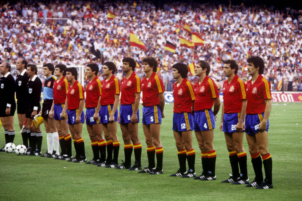
- 1982 Spain (home): Spain’s home kit during the 1982 World Cup, hosted by the country, stood out with classic Adidas styling. It featured vibrant colors and a collared V-neck design, encapsulating a sophisticated early ‘80s fashion.
- 2022 Portugal (home): The striking diagonally split design in Portugal’s home kit by Nike made a significant impression. Its simple yet inspired layout became a standout feature for the team.
- 1998 Croatia (home and away): The 1998 World Cup saw Croatia balance their iconic checkered patterns perfectly across home and away kits, making both memorable.
- 1994 U.S. (away): Known as the “denim kit,” the 1994 U.S. away look became one of the most polarizing yet loved designs over time, sparking a renewed interest in denim aesthetics.
- 2018 Japan (home): Japan’s 2018 kit brought a fresh design with a new badge, highlighting the elegance of the team’s fashion statement during that year.
- 1974 Netherlands (home): An iconic orange shirt with no unnecessary elements, capturing the essence of Dutch football’s simplicity and style.
- 1990 Colombia (home): The bright yellow kit with red and blue winged shoulders remains a vibrant representation of Colombian football spirit.
- 1982 England (home): England’s 1982 kit broke away from typical blandness, introducing a unique and recognizable design that stood out then and remains popular.
- 2026 Norway (home): Norway’s recency introduced a modern classic, inspired by their flag and Norse runes, achieving a bold design that resonates well.
- 2018 Nigeria (home): Nigeria shook the fashion world with their 2018 kit, pushing design boundaries and leaving a lasting impression despite their early exit.
- 1994 Mexico (goalkeeper): Jorge Campos’ neon-infused designs in the 1994 World Cup continue to be remembered for their unique flair, symbolizing mid-90s fashion trends.
- 1986 Argentina (home): Diego Maradona’s 1986 World Cup success immortalized Argentina’s striped kit, featuring a large Le Coq Sportif logo.
- 1986 Brazil (home): A standout in Brazilian kit history, the 1986 design included the Jules Rimet Trophy on the badge, emphasizing their historical success.
- 1998 Mexico (home): Known for its Aztec design, Mexico’s 1998 kit remains one of the most distinctive in the history of the World Cup.
- 1990 West Germany (home): West Germany’s kit achieved iconic status with its elegant and timeless design, standing out as a classic subject in their World Cup victory.
The Worst World Cup Kits
Now, let’s look at the kits that didn’t quite hit the mark.
- 2002 Brazil (home): Despite the team’s success, Brazil’s 2002 kit design was unfavorable with its odd jagged green patterns.
- 2022 U.S. (home): A template design that lacked creativity, the 2022 U.S. kit was marked by dullness and an unattractive neckline.
- 1994 U.S. (away): The denim print design remained divisive, reflecting a bold but contentious fashion choice.
- 1994 Nigeria (away): Expanding patterns from shirt to shorts created too overwhelming a look, marking this kit as excessive.
- 1994 Russia (away): Russia’s design joined the unusual 1994 fashion choices, verging on chaotic in style representation.
- 2022 Switzerland (away): The central design on the Swiss kit gave off an odd bib-like appearance, lacking overall aesthetic appeal.
- 1982 Belgium (home): Echoing the pitfalls of too extensive a pattern, Belgium’s kit resembled caution tape, visually disturbing from head to toe.
- 2026 Switzerland (away): This year’s iteration seemed akin to a toxic spill, embedding a problematic design choice into its fabric.
- 1994 Netherlands (goalkeeper): Offensive in its busy design, the kit looked like a poor concoction of dated carpet patterns, making it hard on the eyes.
- 1930 Bolivia: Misleadingly adorned with “Viva Uruguay,” Bolivia’s kit championed a failed gesture of flattery during the 1930 World Cup.